
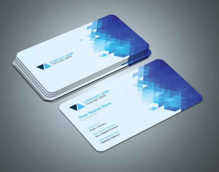
Despite the rise of digital networking platforms, business cards continue to hold powerful influence in professional settings. While LinkedIn connections and email introductions dominate online communication, a physical business card creates a tangible, memorable interaction that digital exchanges simply cannot replicate.
Across Texas — from Houston’s corporate boardrooms to Dallas networking events and Austin startup meetups — professionals still exchange cards as a symbol of credibility and preparedness. When you hand someone a thoughtfully designed business card, you communicate seriousness, professionalism, and brand confidence within seconds.
Business card design is not about decoration. It is about clarity, brand alignment, and strategic presentation.
A well-designed card does more than share contact information. It reinforces your positioning, strengthens brand recognition, and supports long-term professional growth.
Why Business Cards Still Matter in a Digital World
Although technology continues to reshape communication, human interaction remains central to business success. In fact, as digital spaces become increasingly saturated, physical touchpoints stand out even more.
A business card accomplishes several critical objectives simultaneously:
-
It creates an immediate, personal brand impression.
-
It reinforces consistency with your logo and brand system.
-
It signals professionalism and attention to detail.
-
It provides a tangible reminder of your interaction.
When someone leaves a meeting or networking event, your business card often becomes the physical reminder that prompts follow-up communication. Poor design weakens that opportunity. Strong design amplifies it.
Therefore, strategic business card design plays a direct role in conversion, connection, and credibility.
The Challenge of Modern Business Card Design
Designing an effective business card appears simple at first glance. However, significant strategic challenges exist beneath the surface.
1. Limited Space
A standard U.S. business card measures 3.5 x 2 inches. Within that small format, designers must communicate:
-
Name
-
Title
-
Company name
-
Contact details
-
Website
-
Logo
-
Potentially a tagline or QR code
Because space remains limited, hierarchy becomes critical. Every millimeter must serve a purpose.
2. Readability at Small Scale
Fonts that look clean on a website may become illegible when reduced to small print. Designers must carefully select typography that remains sharp and readable at smaller sizes without sacrificing brand personality.
3. Alignment With Brand Identity
A business card should never feel disconnected from your broader branding. Instead, it must align perfectly with:
-
Logo design
-
Brand colors
-
Typography system
-
Brand voice and positioning
Inconsistency damages trust. Consistency builds authority.
4. Print Quality Considerations
Unlike digital graphics, printed materials require technical preparation. Designers must account for:
-
Bleed settings
-
Safe margins
-
CMYK color formatting
-
Resolution standards (300 DPI minimum)
-
Paper type compatibility
Without proper preparation, even a beautiful design can print poorly.
Poor design wastes opportunity. Strategic design transforms a small card into a powerful marketing tool.
What Makes an Effective Business Card?
Professional business card design combines clarity, balance, and intention. The most effective cards share several essential characteristics.
Clean Hierarchy
Hierarchy guides the viewer’s eye.
Your name should stand out first. Your title follows. Then contact details support that primary information. When hierarchy is unclear, the card feels confusing and cluttered.
Strong hierarchy answers three immediate questions:
- Who are you?
- What do you do?
- How can someone reach you?
If those answers are not instantly clear, the design needs refinement.
Legible Fonts
Because space is limited, typography plays an even more critical role than in larger print materials.
Professional designers select fonts that:
-
Maintain clarity at small sizes
-
Reflect industry standards
-
Align with brand personality
-
Print sharply without distortion
For example, law firms may prefer refined serif fonts that communicate authority, while tech startups often lean toward clean sans-serif typefaces that signal innovation.
Legibility always outweighs trendiness.
Strategic Use of White Space
Many people attempt to fill every available inch of their card. However, white space — or negative space — strengthens design impact.
White space:
-
Improves readability
-
Creates breathing room
-
Enhances perceived sophistication
-
Highlights key information
Cluttered cards feel chaotic. Balanced cards feel confident.
High-Quality Print Setup
Even the strongest layout fails if the file preparation lacks precision.
Professional designers ensure:
-
Correct bleed settings (usually 0.125 inches)
-
Safe margins for text placement
-
Proper color conversion to CMYK
-
Vector-based logo files for crisp printing
These technical details prevent costly printing mistakes and maintain brand integrity.
Common Business Card Design Mistakes
Without professional guidance, businesses often fall into avoidable traps.
Overcrowded Layouts
Trying to include too much information leads to cramped designs. Excess details dilute your primary message.
Inconsistent Branding
Using colors or fonts that do not match your website or logo weakens brand recognition. Consistency builds trust across platforms.
Low-Resolution Logos
Raster images or compressed logo files result in blurry printing. Vector formats maintain sharpness.
Poor Paper Selection
Thin paper feels disposable. Flimsy cards reduce perceived professionalism. Heavier cardstock communicates quality and seriousness.
Trend-Based Designs
Heavy gradients, overly decorative fonts, or flashy graphics may look appealing today but quickly feel outdated.
Professional design prevents these errors and ensures your card remains timeless.
What a Professional Business Card Package Includes
A structured design package ensures clarity and scalability.
Typically, a professional package includes:
-
Front and back layout design
-
Multiple concept options
-
Print-ready PDF files
-
Bleed and margin setup
-
Color calibration guidance
-
Font alignment with brand system
-
Specialty finish recommendations (foil, embossing, spot UV)
-
Optional QR code integration
-
Social media icon placement (if appropriate)
Rather than delivering a single graphic, professional designers create a complete, technically prepared print system.
Why Texas Professionals Need Strong Business Cards
Texas maintains one of the most relationship-driven business cultures in the United States.
Across industries such as:
-
Real estate
-
Law
-
Healthcare
-
Oil & gas
-
Technology
-
Construction
-
Financial services
Networking remains central to growth.
In cities like Houston, Dallas, Austin, and San Antonio, conferences, association events, trade shows, and client meetings frequently involve physical introductions. During those exchanges, your business card becomes a representation of your brand standards.
Because Texas markets remain competitive and growth-oriented, your materials must reflect credibility immediately.
A locally aligned design reflects awareness of:
-
Regional professionalism standards
-
Industry expectations
-
Competitive positioning
-
Cultural nuances in networking environments
Strong business card design does not simply look good — it communicates that you understand your market.
The Role of Paper, Finish, and Texture
Design extends beyond layout. Material selection significantly impacts perception.
Cardstock Thickness
Standard professional cards often use 14pt to 16pt cardstock. Premium cards may use 18pt or higher for added durability.
Thicker cards:
-
Feel substantial
-
Signal quality
-
Resist wear
-
Create stronger tactile impressions
Specialty Finishes
Modern business cards may incorporate:
-
Matte or soft-touch coating
-
Gloss accents
-
Embossing or debossing
-
Foil stamping
-
Spot UV highlights
However, restraint remains critical. Specialty finishes should enhance the design, not overwhelm it.
Strategic texture elevates perception.
Should You Use Both Sides?
Yes — but strategically.
Using the back of the card allows for:
-
Brand tagline placement
-
QR code integration
-
Minimalistic logo display
-
Service highlights
-
Appointment reminders (for service providers)
However, overcrowding either side weakens impact. Designers must balance clarity with utility.
Integrating QR Codes Effectively
QR codes bridge print and digital.
When placed thoughtfully, they can direct recipients to:
-
Portfolio pages
-
Booking systems
-
LinkedIn profiles
-
Landing pages
-
Contact forms
However, they must remain:
-
Scannable at small size
-
Surrounded by adequate white space
-
Aligned with brand styling
Poorly placed QR codes disrupt aesthetics. Properly integrated ones enhance functionality.
FAQs – Business Card Design
What size is standard in the US?
The standard U.S. size is 3.5 x 2 inches.
Should both sides be used?
Yes, as long as the content remains clear and uncluttered.
What paper works best?
Thicker cardstock improves durability and perceived professionalism. Matte finishes often appear more sophisticated than glossy finishes.
Can QR codes be added?
Yes. When placed strategically, QR codes enhance digital engagement without overwhelming the design.
Why hire a local Texas designer?
Local expertise ensures alignment with regional business culture, industry expectations, and competitive positioning.
How Business Cards Support Long-Term Branding
A business card rarely acts alone. Instead, it functions as one component within a broader branding ecosystem.
When aligned correctly, your card supports:
-
Website design
-
Social media branding
-
Presentation materials
-
Email signatures
-
Proposal documents
-
Trade show displays
Consistency across all materials strengthens brand recall and builds trust over time.
Without that alignment, businesses appear fragmented. With it, they appear established.
Conclusion
A business card often serves as the first physical representation of your brand. In a matter of seconds, it communicates professionalism, clarity, and attention to detail. While digital communication continues to expand, tangible materials still shape perception in powerful ways.
In Texas’s competitive, relationship-driven business landscape, strong business card design supports meaningful connections and lasting impressions. Rather than viewing it as a minor marketing asset, professionals should treat it as a strategic branding tool that reinforces credibility at every introduction.
When thoughtfully designed, properly printed, and aligned with your overall identity, a business card does more than share contact information — it strengthens recognition, builds authority, and supports long-term professional growth.




0 Comments